Colors and Contrast
3 min read
Whether you want to adjust an existing colour scheme to be more accessible or build an accessible colour palette from scratch, here are some tools to help you out.
Improve colour scheme
Most of the time we don't need to create a whole new colour palette from scratch, just tweak the existing colours to make them more accessible.
How to find contrast issues
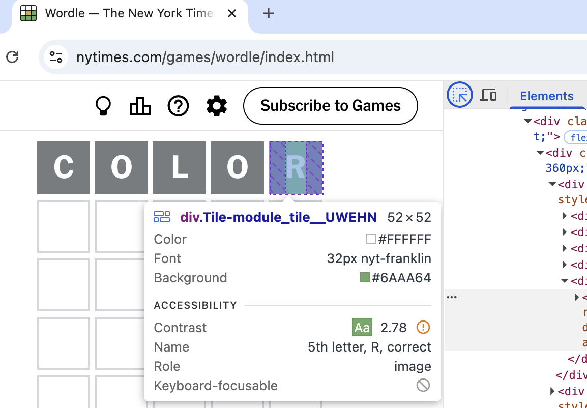
In almost every browser, the selection tool will show you the colour contrast ratio of text elements.
For Chrome try this:
- Open the developer tools with right click, option 'Inspect', then pick the select icon
- Hover over an element on the page to find the contrast ratio
- Some browsers (e.g. Firefox) will also show you the WCAG level it meets (if any)
How to fix colour issues
- OKLCH: easy way to find a lighter/darker shade
-
Learn UI Accessible color generator: Find the closest accessible match of a colour
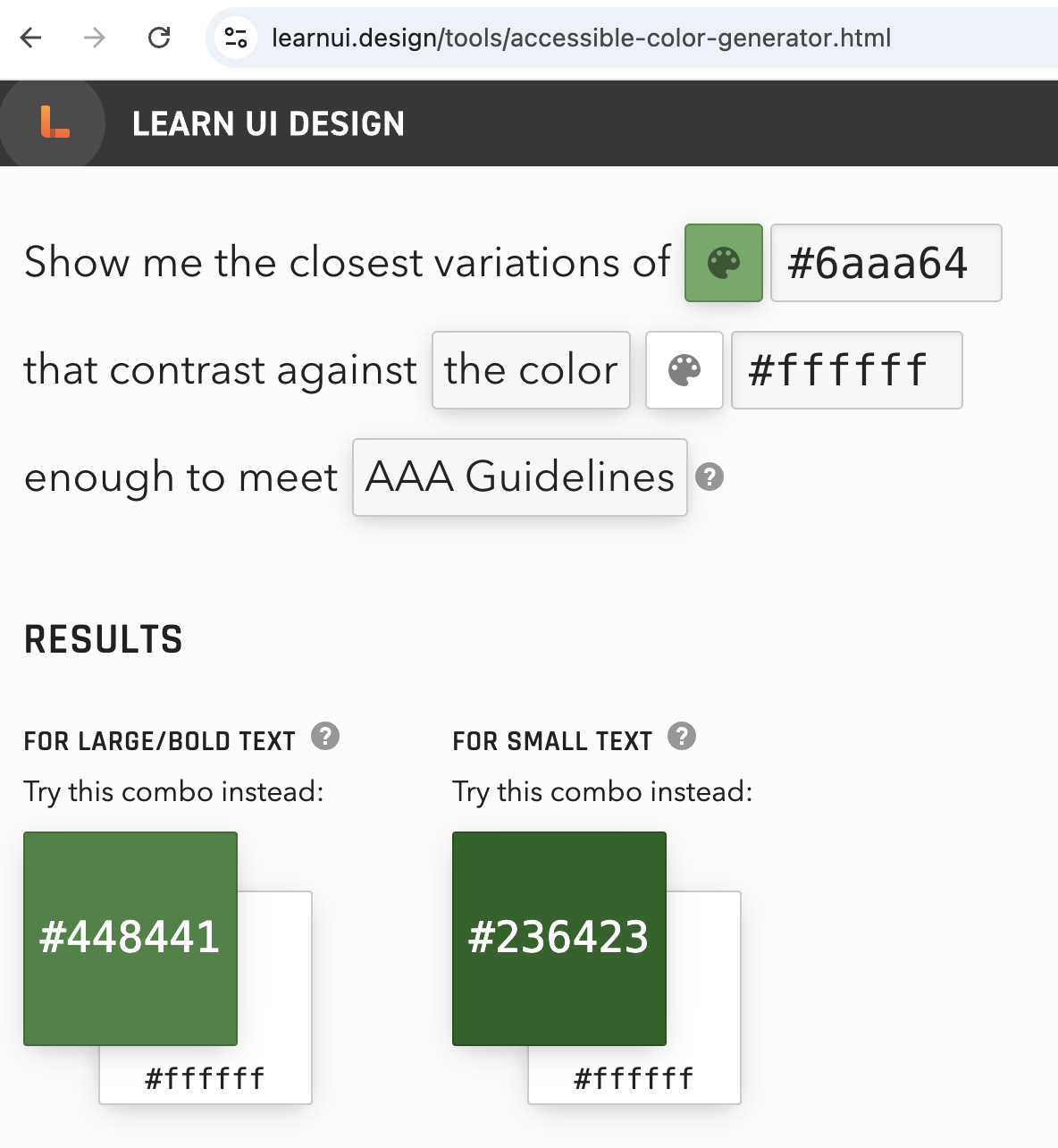
Learn UI gives a more accessible close match of the original colour
How to build a full color palette:
- Youtube video: "How I make UI color palettes" UX Tools
- OKLCH color palette generator
- Randoma11y: Get two random accessible colours
- Venngage Accessible Color Palette Generator
- Colorsafe: Find accessible options for text ratios contrast
- Tanguru contrast finder: Find color contrasts and accessible alternatives
- Meyerweb Color Blend Tool: Generate up to 10 blend steps between two colours
- Huemint - to see your colors in action
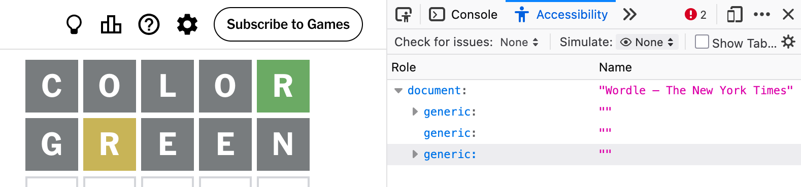
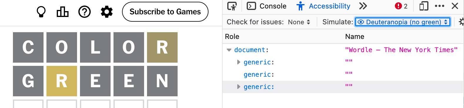
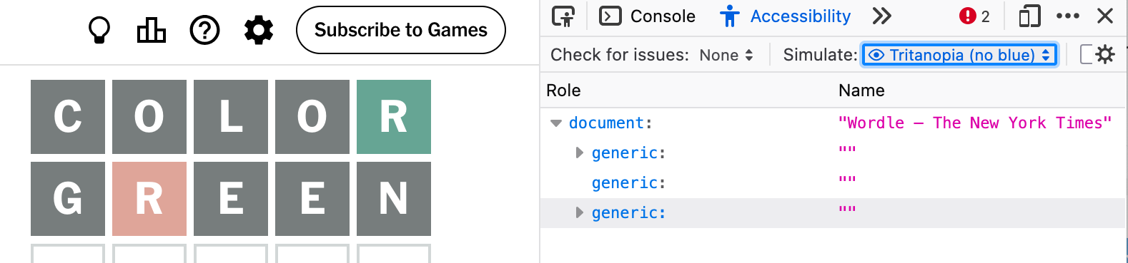
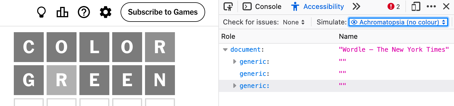
Got your draft palette? Check out what it looks like for different people.
Firefox Accessibility Inspector has a color vision simulation tool.
Here is what Wordle looks like from different perspectives:
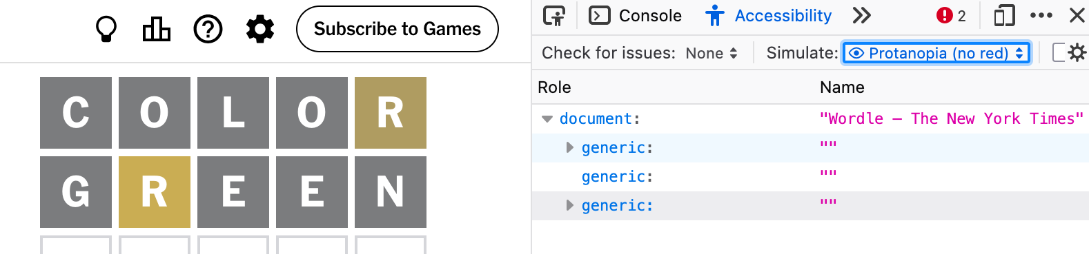
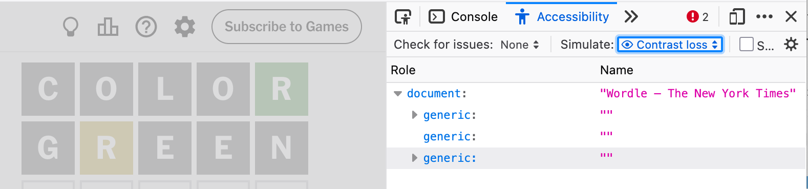
While color simulators can never replace testing your product with disabled users, they can still be a useful reminder that colour can be experienced in many different ways.