Colors and contrast
Tools to use color accessibly
Here's a list of great resources to find the right color
and colour contrasts during development.
None of this is sponsored or affiliated in any way, just cool tools I've found
over the last few months.
There's two parts in this blog post you can skip to:
1) Check and fix colour contrast issues
Most of the time we don't need to create a whole new colour palette from scratch, just tweak the existing colours to make them more accessible.
Check the colour contrast ratio
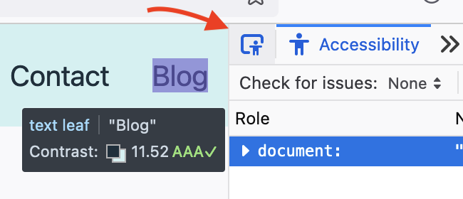
To check your text-background contrast in browser, you can use the Firefox Accessibility Inspector. Either run a full check in the "Check fo issues" tab, or click on the picker icon to "Pick accessible object from page" and hover over the text element to get the contrast ratio and related WCAG level.

Arrow pointing at the Accessibility Picker in Firefox
Find better colours
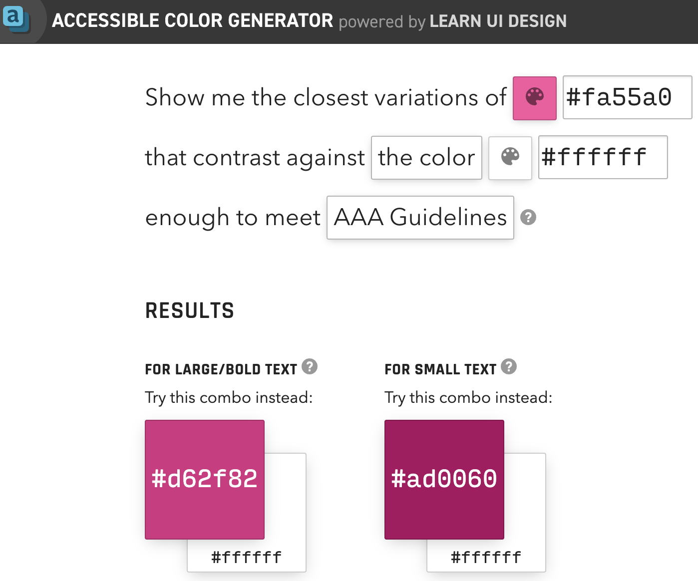
The Accessible Colour Generator by LearnUI is a great tool to quickly find the closest accessible match of a colour combination.

Learn UI Design's Website to find close matching accessible color options
2) Build a full color palette:
Sometimes we do want to create a full colour palette.
General Tips
This video has some general, practical tips for creating color palettes for your website or project:
Youtube video: "How I make UI color palettes" UX ToolsTools
And these tools are great for building your color palette accessibly:
Randoma11y: Get two random accessible colours Venngage Accessible Color Palette Generator Colorsafe: Find accessible options for text ratios contrast Tanguru contrast finder: Find color contrasts and accessible alternatives Meyerweb Color Blend Tool: Generate up to 10 blend steps between two coloursGot your draft palette? Check out what it looks like for different people.
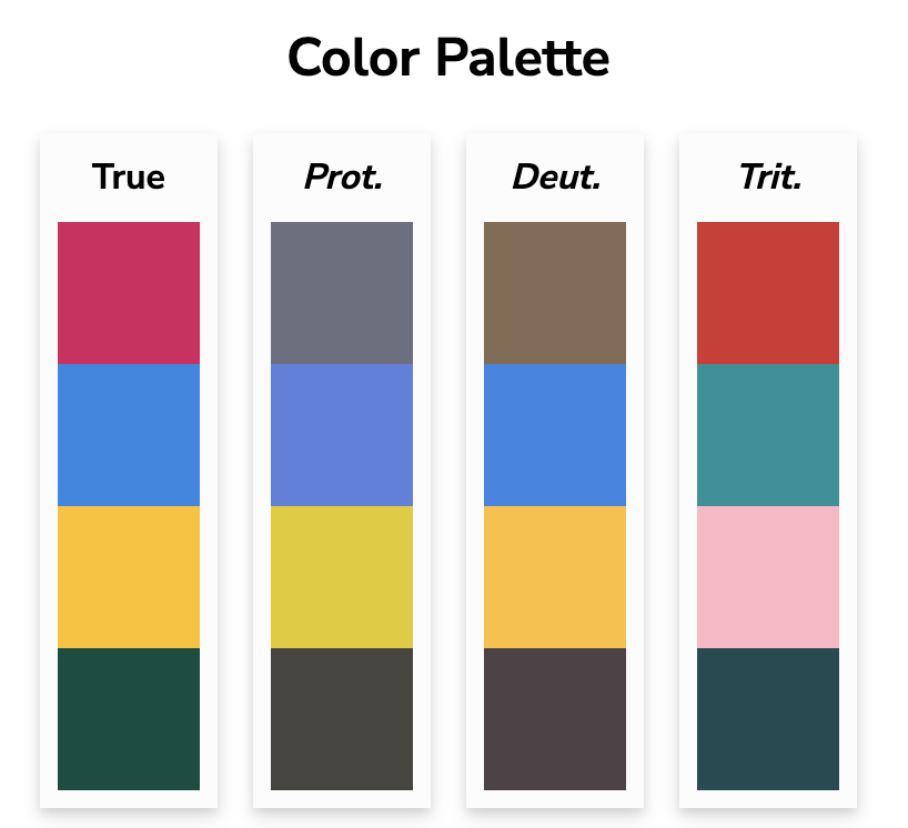
You could use Coloring for Colorblindness to have a look at the colors you've picked side to side:

Four colors as seen with protanopia, deuteranopia, tritanopia
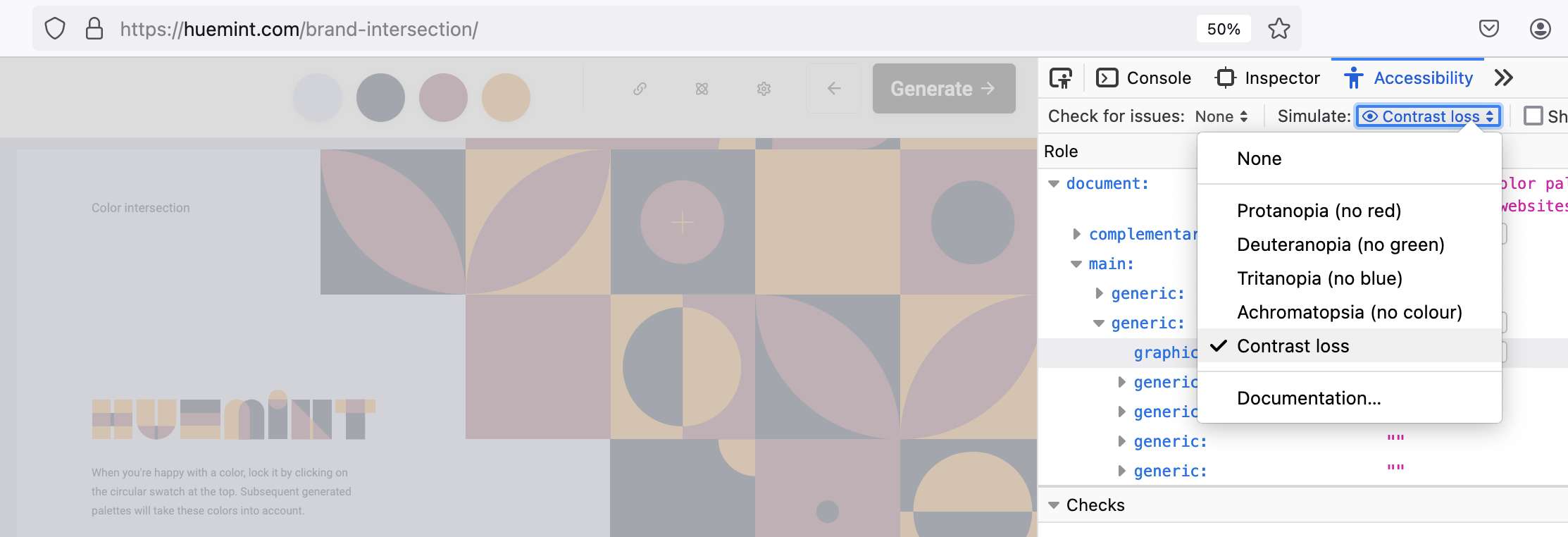
Or, you can add your color scheme on Huemint and then use the Firefox color simulation.

Huemint website seen with Firefox simulation of contrast loss
Summary
Thanks for reading!
Feedback is always welcome: Whether you want to share
your thoughts about what you liked, what could be
improved, or just want to chat about accessibility,
feel free to get in touch!
